How To Create Sidebar Menu With Html,css And Js.
Hello Guys,
Today I will share how we can create an attractive menu or navbar on our website. For this, I will use the minimum line of code. In this tutorial, Menu will be displayed at the top in the desktop browser but for the mobile, it will be open from the sidebar.
For this, we will use HTML, CSS, and Javascript.
Let's start the code.
HTML
CSS
:root {
  --header-height: 53px;
}
* {
  margin: 0;
  padding: 0;
  box-sizing: border-box;
  font-family: Segoe UI, SegoeUI, "Helvetica Neue", Helvetica, Arial, sans-serif;
  text-decoration: none;
  -webkit-tap-highlight-color: transparent; /*for removing the blue color layer when clicked on mobile devices*/
    word-break: break-word;
}
header {
  box-shadow: rgba(0, 0, 0, 0.16) 0px 1px 4px;
  position: -webkit-sticky;
  position: sticky;
  top: 0;
  background: #fff;
  z-index: 250;
  height: var(--header-height);
}
.header {
  max-width: 1400px;
  width: 100%;
  margin: 0 auto;
  display: flex;
  align-items: center;
  justify-content: space-between;
  height: var(--header-height);
}
.header .logo {
  font-family: 'Comforter Brush', cursive;
padding-left: 40px;
  font-size:38px;
}
.header .menu .drawer {
  display: flex;
  height: var(--header-height);
  padding-right: 100px;
}
.header .menu .drawer a {
  text-transform: capitalize;
  transition: all 0.1s linear;
  display: flex;
  align-items: center;
  padding: 0 30px;
  color: #585b63;
  font-size: 17.4px;
}
.header .menu .drawer a:hover {
  background: #f3f3f3;
}
.header .menu .drawer a:active {
  background: #e0e0e0;
}
.menu-btn,
.close-btn {
  background: transparent;
  border: none;
  height: 40px;
  width: 40px;
  border-radius: 50%;
  position: absolute;
  left: 11px;
  top: 8px;
  display: none;
  cursor: pointer;
}
.menu-btn {
  left: 3px;
}
.close-btn:active,
.menu-btn:active {
  background: #f3f3f3;
}
.img{
 height:calc(100vh - 53px);
 width:100%;
  object-fit:cover;
  display:block;
}
@media (max-width: 1140px) {
  .header .menu .drawer {
    padding: 0;
  }
}
.body {
  overflow: hidden;
}
@media (max-width: 920px) {
  .header .menu {
    display: flex;
    position: fixed;
    top: 0;
    left: -925px;
    width: 100%;
    height: 100%;
    z-index: 300;
  }
  .header .menu .blank {
    height: 100%;
    flex: 1;
  }
  .header .menu .drawer {
    box-shadow: 2px 0 12px rgb(0 0 0 / 40%);
    padding-top: 50px;
    height: 100%;
    width: 225px;
    background: #fff;
    flex-direction: column;
    position: fixed;
    left: -240px;
    transition: all 200ms linear;
    overflow: auto;
  }
  .header .menu .drawer a {
    padding: 20px;
  }
  .menu-btn,
  .close-btn {
    display: block;
  }
  .header .logo {
    margin-left: 17px;
  }
  .drawer-visible {
    left: 0 !important;
  }
  .blur {
    background: rgba(0, 0, 0, 0.6);
    backdrop-filter: blur(15px);
    left: 0 !important;
  }
}
Javascript
const menu_btn = document.querySelector(".menu-btn");
const close_btn = document.querySelector(".close-btn");
const menu = document.querySelector(".menu");
const drawer = menu.querySelector(".drawer");
const blank = menu.querySelector(".blank");
const body = document.querySelector("body");
const close = () => {
  menu.classList.remove("blur");
  drawer.classList.remove("drawer-visible");
  body.classList.remove("body");
};

menu_btn.addEventListener("click", (e) => {
  menu.classList.add("blur");
  drawer.classList.add("drawer-visible");
  body.classList.add("body");
});

close_btn.addEventListener("click", (e) => {
  close();
});

blank.addEventListener("click", (e) => {
  close();
});

Array.from(drawer.querySelectorAll("a")).forEach((element) => {
  element.addEventListener("click", () => {
    close();
  });
});
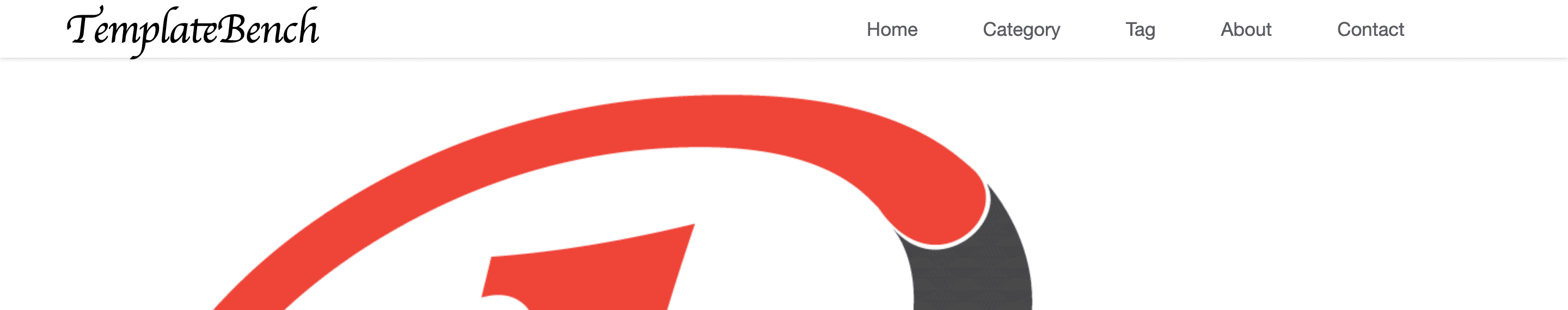
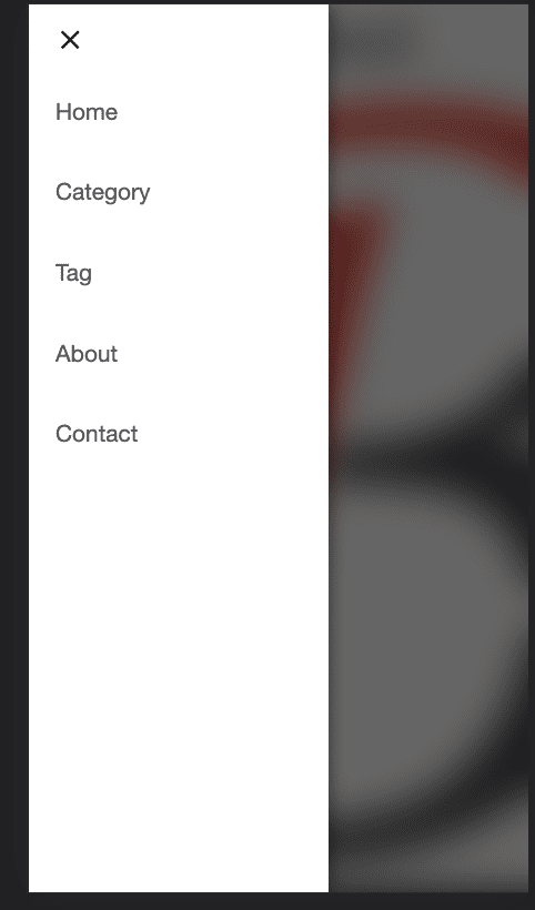
This is our complete code. Now we can check the result in the browser. In the desktop browser, it will show a menu at the top bar. but when you will resize the browser then you can see the sidebar menu view.
Result Desktop View
Result Mobile View
Hope You guys like this tutorial. Please follow my social media channel to support me and for the latest post notifications.
Thanks

Templatebench
We are Template bench. We love programming. We also love to share tips and tricks with you.